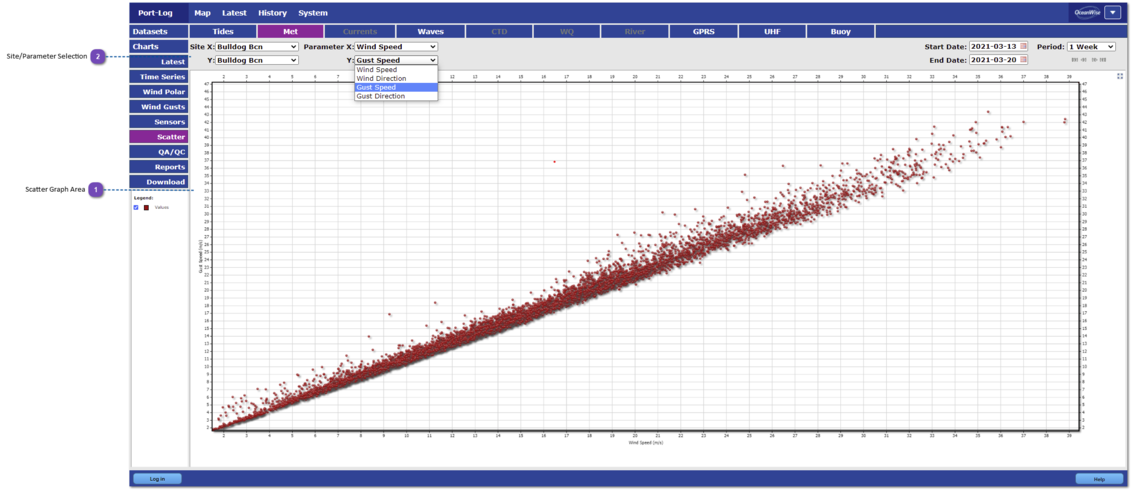
This is an example showing how Scatter Plots of the data are displayed within the History pages.
The scatter plots allow the user to compare different dataset parameters (for example, Observed vs Predicted tidal heights).
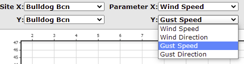
Within the full version of Port-Log, the user can select which parameters to compare by selecting options next to the Site selection, as X and Y parameters.
Scatter Graph Area
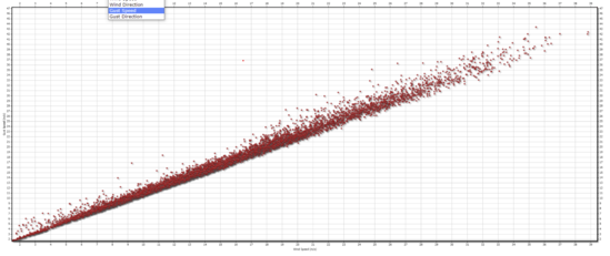
The selected data are drawn in the main window. When the user selects two different parameters as X and Y (such as Observed and Predicted tidal heights, or Wind Speed versus Gust Speed, as highlighted here), these will appear as a scatter plot, giving the user more insight into their relationship and similarities/differences between the parameters.
Four drop-down menus in the top left of the graph area allow the user to select which sites or parameters to compare. The graph area will then update with the chosen selection.